

GreenShield +
Simplifying health access for over 4M+ plan members with a first-of-its-kind integrated mobile solution that reinvents the health-care experience.
GreenShield Canada (GSC) is a comprehensive healthcare payer-provider that merges insurance benefits with healthcare providers. With the goal of streamlining your health experience, GSC has acquired numerous health service providers and seamlessly integrated them into a groundbreaking, integrated solution called GreenShield Plus.
Request Full Case Study →
Project details
Merging Legacies: After several acquisitions, each company brought its own architecture and tech stack, creating fragmented systems and siloed user experiences.
Complex Change Management: The fragmented setup made product updates and feature rollouts slow and complicated.
Unifying the Experience: Alongside these challenges, a standalone mobile counselling app + five additional health service products, needed to be seamlessly integrated into one cohesive ecosystem.
Research Requirements
Defining the Focus: The research set out to determine whether the app’s intended business positioning truly aligned with real user behaviour, and to uncover any gaps between the two.
Shaping the Strategy: Beyond user insights, the goal was to clarify the organization’s broader mobile vision by understanding how the app should evolve and how acquired products could be unified under a scalable architecture.
Grounding in Research: In-depth interviews, in-app surveys, and a comprehensive design audit were conducted to pinpoint issues such as feature bloat and UX inconsistencies, forming the foundation for a more cohesive, user-centred experience.
Everything Built
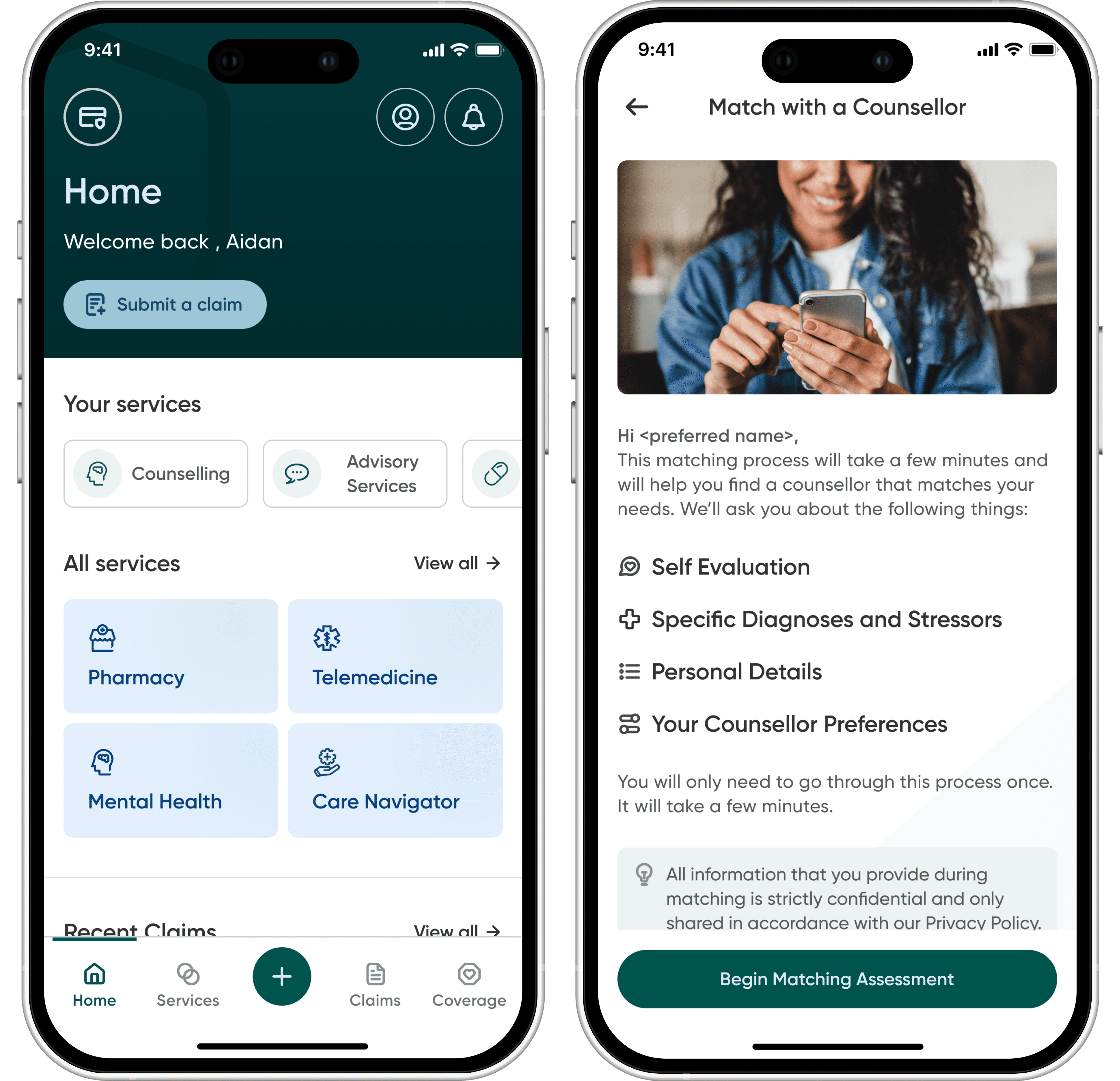
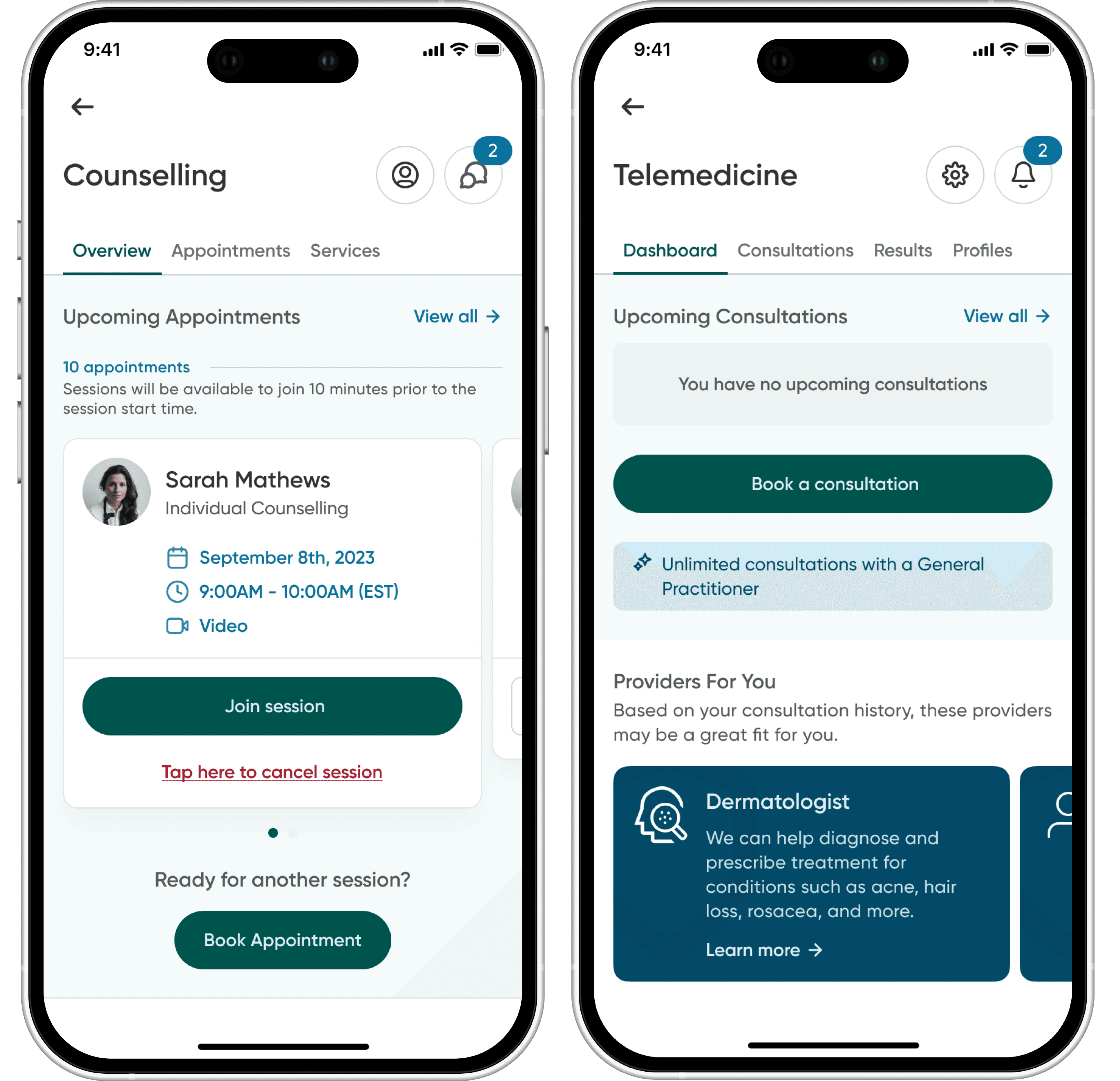
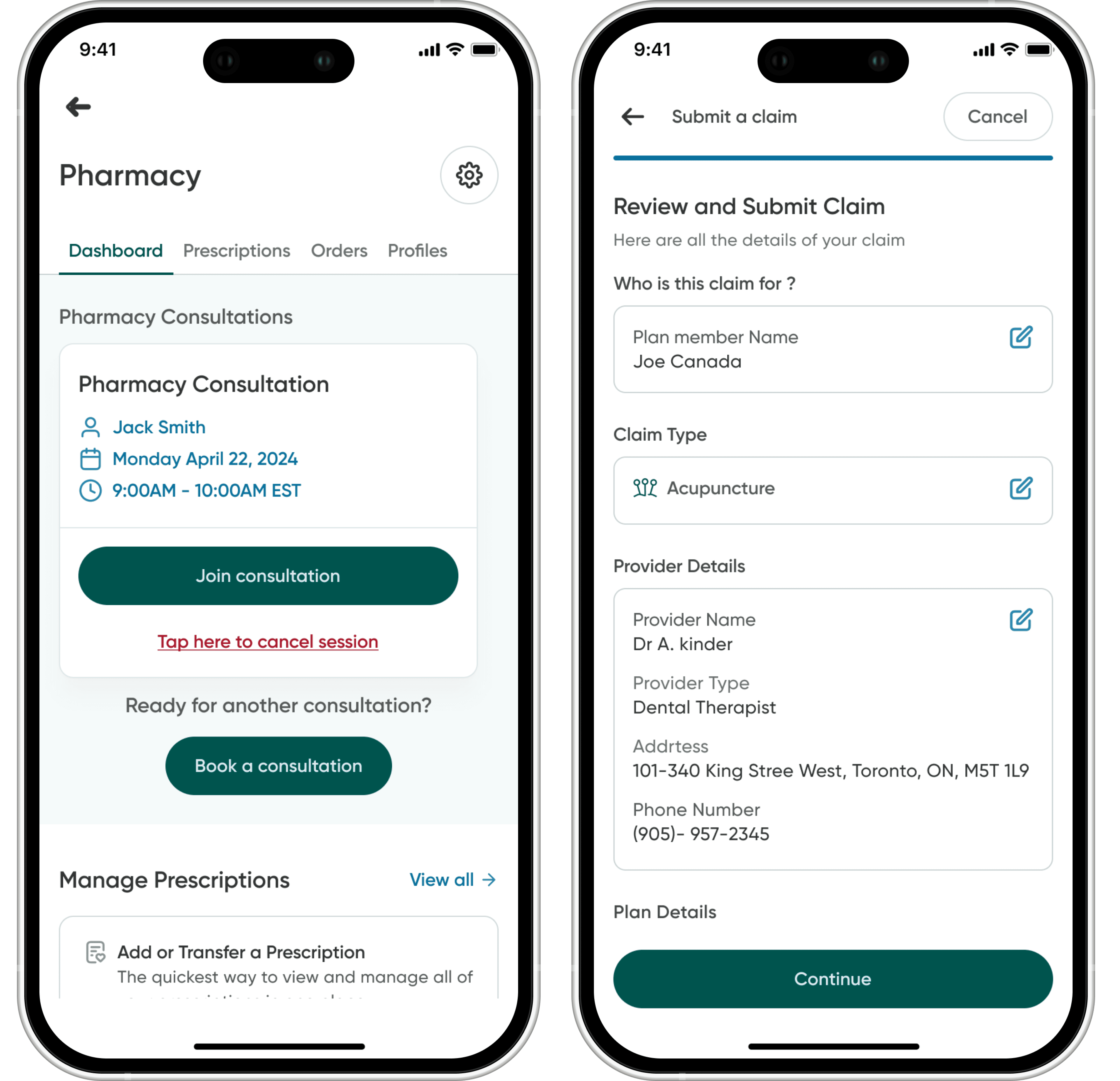
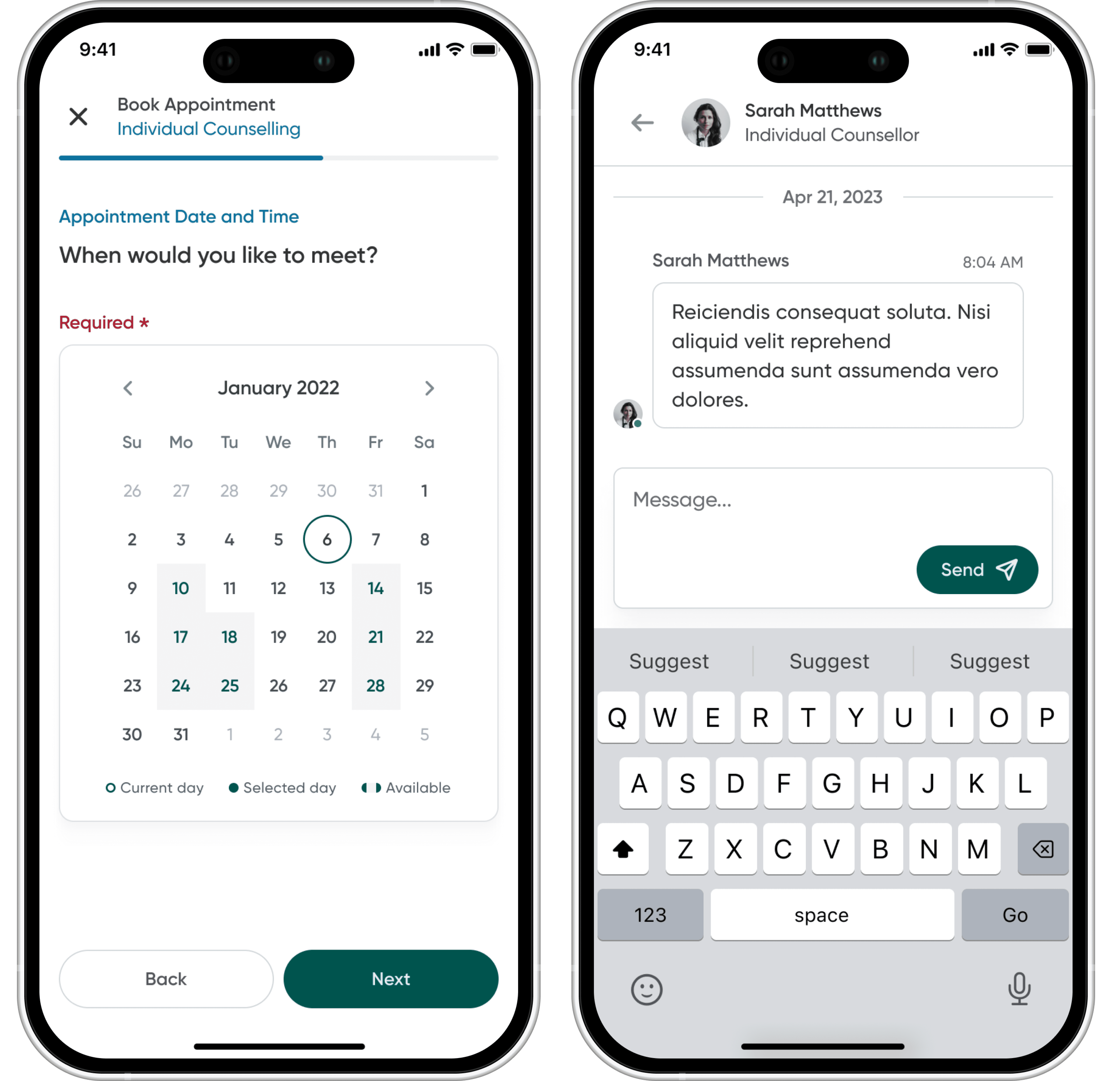
Unifying the Ecosystem: All legacy mobile experiences from acquired products were embedded within the new GS+ app, creating a single, seamless entry point for users across multiple health services.
Rebuilding the Foundation: The information architecture and site map were completely restructured to organize every embedded service under one cohesive navigation model, simplifying discovery and improving usability.
Designing for Enterprise and Scale: Scalable interface patterns and mobile design components were developed and contributed to the new mobile design system, establishing a consistent visual language and enabling faster future iterations.
Results
+288% Increase in conversion rates on the new GS+ mobile app.
32,000+ Counselling sessions had yearly since launch. Allowing for slower wait times, and direct access for Canadians in need of support.
93% Satisfaction rating of users utilizing the Telemedicine services upon launch. Since the first year of launch there have been 2900+ consultations.
Final Screens

Project Learnings
Leading with Conviction: This project built confidence to push back when design decisions conflicted with user needs or product and business goals. This was an essential skill when navigating enterprise constraints.
Balancing Design and Delivery: My role evolved into a hybrid of design lead and project manager. This meant overseeing timelines, aligning cross-functional priorities, and guiding a small team of junior designers through shifting requirements and deadlines.
Building Stronger Opinions: Over time, this project strengthened my ability to form and defend a clear design perspective. One that was grounded in data and evidence, not preference.
Designing for Scale: Working within enterprise systems taught the value of scalable architecture and reusable patterns, and a deeper understanding for building tokenized Design Systems.
Consistency Through Complexity: The project deepened understanding of how to bring coherence to fragmented ecosystems, balancing usability, brand consistency, and technical feasibility across diverse platforms.
Embracing the Journey: While this case study reads linearly, in reality it spanned two years of iteration, setbacks, and course corrections that shaped both the product and my approach to problem-solving.